CSS(Cascading Style Sheets,层叠样式表)是用于描述 HTML 元素在屏幕、纸张等媒体上显示样式的语言。它的核心优势在于层叠性(多个样式规则可叠加应用)和复用性(单个样式文件可控制多个网页),极大地简化了网页样式管理。与 HTML(结构)和 JS(交互)相比,CSS 的调试复杂度主要源于样式优先级和层叠规则,但掌握其核心知识点后,就能灵活实现各类网页布局与美化效果。
CSS 语法和选择器
基本语法
CSS 规则集(rule-set)由选择器和声明块组成,核心结构如下:
- 选择器:指定要设置样式的 HTML 元素
- 声明块:包含 1 条或多条声明,用花括号
{}包裹
- 每条声明:由
属性名: 属性值组成,多条声明用分号;分隔
1
2
3
4
5
6
7
8
9
|
h1 {
color: red;
font-size: 14px;
}
p {
color: blue;
text-align: center;
}
|
选择器分类
选择器的核心作用是 “精准选取” 需要样式化的 HTML 元素,以下是完整分类及实践示例:
简单选择器(按名称、ID、类选取)
| 选择器类型 |
语法 |
示例 |
说明 |
| 元素选择器 |
元素名 |
p { ... } |
选取所有指定 HTML 元素 |
| ID 选择器 |
#id值 |
#para1 { ... } |
选取 ID 唯一的元素(页面中 ID 不可重复) |
| 类选择器 |
.类名 |
.center { ... } |
选取所有带指定 class 的元素 |
| 通用选择器 |
* |
* { ... } |
选取页面所有 HTML 元素 |
| 分组选择器 |
元素1, 元素2 |
h1, h2, p { ... } |
选取多个元素统一设置样式 |
1
2
3
4
5
6
7
8
9
10
11
12
13
14
15
16
17
18
19
20
21
22
23
24
25
26
27
28
29
30
31
32
33
34
35
36
37
38
39
40
41
| <!DOCTYPE html>
<html>
<head>
<style>
p {
text-align: center;
color: red;
}
#para1 {
font-weight: bold;
}
.center {
background-color: #f5f5f5;
}
* {
margin: 0;
padding: 0;
box-sizing: border-box;
}
h1, h2 {
color: #333;
text-align: center;
}
</style>
</head>
<body>
<h1 class="center">标题1</h1>
<h2>标题2</h2>
<p id="para1" class="center">ID选择器+类选择器示例</p>
<p>元素选择器示例</p>
</body>
</html>
|
组合器选择器(按元素关系选取)
CSS 提供 4 种组合器,用于描述选择器之间的关系:
| 组合器 |
语法 |
示例 |
说明 |
| 后代选择器 |
选择器 1 选择器 2 |
div p { ... } |
选取选择器 1 内的所有后代选择器 2(包括子、孙等) |
| 子选择器 |
选择器 1 > 选择器 2 |
div > p { ... } |
仅选取选择器 1 的直接子元素选择器 2 |
| 相邻兄弟选择器 |
选择器 1 + 选择器 2 |
div + p { ... } |
选取选择器 1 后紧邻的第一个兄弟元素选择器 2 |
| 通用兄弟选择器 |
选择器 1 ~ 选择器 2 |
div ~ p { ... } |
选取选择器 1 后所有同级兄弟元素选择器 2 |
1
2
3
4
5
6
7
8
9
10
11
12
13
14
15
16
17
|
div p {
color: green;
}
div > p {
font-size: 16px;
}
div + p {
font-weight: bold;
margin-top: 10px;
}
div ~ p {
background-color: #e8f4f8;
}
|
1
2
3
4
5
6
7
8
| <div>
<p>div的直接子级p(子选择器+后代选择器生效)</p>
<div>
<p>div的孙级p(仅后代选择器生效)</p>
</div>
</div>
<p>div紧邻的第一个p(相邻兄弟+通用兄弟生效)</p>
<p>div后的第二个p(仅通用兄弟生效)</p>
|
伪类选择器(按元素状态选取)
伪类用于选择处于特定状态的元素,常见场景:链接状态、鼠标交互等。
1
2
3
4
5
6
7
8
9
10
11
12
13
14
15
16
17
18
19
20
21
22
23
24
25
26
27
|
a:link {
color: #FF0000;
text-decoration: none;
}
a:visited {
color: #00FF00;
}
a:hover {
color: #FF00FF;
text-decoration: underline;
}
a:active {
color: #0000FF;
}
input:focus {
border: 2px solid #0088ff;
outline: none;
}
li:nth-child(odd) {
background-color: #f5f5f5;
}
|
伪元素选择器(选取元素部分内容)
伪元素用于对元素的特定部分设置样式(如首行、首字母),语法为选择器::伪元素。
1
2
3
4
5
6
7
8
9
10
11
12
13
14
15
16
17
18
19
20
21
22
23
24
25
|
p::first-line {
font-size: 18px;
color: #0088ff;
font-weight: bold;
}
p::first-letter {
font-size: 24px;
color: #ff6700;
}
h3::before {
content: "📌 ";
}
h3::after {
content: " - 重要";
color: red;
}
::selection {
background-color: #fff3cd;
color: #d9534f;
}
|
属性选择器(按属性或属性值选取)
根据元素的属性或属性值筛选元素,灵活度极高。
1
2
3
4
5
6
7
8
9
10
11
12
13
14
15
16
17
18
19
|
a[target] {
background-color: yellow;
padding: 2px 5px;
}
a[target="_blank"] {
background-color: #e8f4f8;
border: 1px solid #0088ff;
}
a[href^="https"] {
color: #28a745;
}
[class*="btn"] {
padding: 5px 10px;
border-radius: 4px;
}
|
选择器优先级
当多个选择器作用于同一元素时,优先级规则决定最终生效的样式:
优先级权重:!important(最高)> 行内样式(1000)> ID 选择器(100)> 类 / 伪类 / 属性选择器(10)> 元素 / 伪元素选择器(1)> 通用选择器(0)
层叠顺序(从高到低):行内样式(直接写在元素 style 属性中),内部样式表(<style>标签内),外部样式表(.css文件),浏览器默认样式
注意:!important会强制覆盖其他样式,但尽量少用(破坏自然层叠),仅在特殊场景使用。
CSS 使用方法和常见属性
CSS 使用方法
外部 CSS(推荐)
将样式写在独立的.css文件中,通过<link>标签引入,可复用性最强。
创建style.css文件
1
2
3
4
5
6
7
8
9
|
body {
font-family: "PingFang SC", sans-serif;
background-color: #f8f9fa;
}
h1 {
color: #333;
text-align: center;
}
|
在 HTML 中引入:
1
2
3
4
5
6
7
8
9
10
| <!DOCTYPE html>
<html>
<head>
<link rel="stylesheet" type="text/css" href="style.css">
</head>
<body>
<h1>外部CSS示例</h1>
</body>
</html>
|
内部 CSS
样式写在 HTML 的<style>标签内,仅作用于当前页面,适合单页面特殊样式。
1
2
3
4
5
6
7
8
9
10
11
12
13
14
15
16
17
18
19
20
21
22
23
24
| <!DOCTYPE html>
<html>
<head>
<style>
body {
background-color: linen;
}
h1 {
color: maroon;
margin-left: 40px;
}
</style>
</head>
<body>
<h1>内部CSS示例</h1>
</body>
</html>
````
#### 行内 CSS
直接写在元素的style属性中,仅作用于单个元素,优先级最高但复用性最差。
```html
<h1 style="color: blue; text-align: center;">行内CSS示例</h1>
<p style="color: red; font-size: 16px;">这是一个段落</p>
|
核心常见属性
CSS 注释
注释用于解释代码,浏览器会忽略,语法:/* 注释内容 */(单行 / 多行通用)。
1
2
3
4
5
6
7
8
|
p {
color: red;
}
|
颜色属性
CSS 支持多种颜色表示方式:
| 类型 |
语法 |
示例 |
| 颜色名称 |
英文颜色名 |
color: red; |
| RGB |
rgb(红, 绿, 蓝) |
rgb(255, 0, 0)(红色) |
| RGBA |
rgba(红, 绿, 蓝, 透明度) |
rgba(255, 0, 0, 0.5)(半透明红) |
| HEX |
#十六进制 |
#ff0000(红色)、#f00(简写) |
| HSL |
hsl(色相, 饱和度%, 明度%) |
hsl(0, 100%, 50%)(红色) |
1
2
3
4
5
6
7
8
9
10
11
12
13
14
15
16
17
18
19
20
21
22
23
24
25
26
27
28
29
30
31
| .color-demo {
width: 100px;
height: 100px;
margin: 10px;
display: inline-block;
}
.color1 {
background-color: Tomato;
}
.color2 {
background-color: rgb(76, 175, 80);
}
.color3 {
background-color: rgba(33, 150, 243, 0.7);
}
.color4 {
background-color: #9c27b0;
}
.color5 {
background-color: hsl(240, 100%, 50%);
}
|
背景图像属性
background-image用于设置元素背景图像,常用配套属性:
1
2
3
4
5
6
7
8
9
10
11
12
13
|
body {
background-image: url("paper.gif");
background-repeat: no-repeat;
background-position: center;
background-size: cover;
background-attachment: fixed;
}
body {
background: url("paper.gif") no-repeat center/cover fixed;
}
|
边框属性
边框属性用于设置元素边框的样式、宽度、颜色,支持细粒度控制。
| 属性 |
说明 |
示例 |
| border-style |
边框样式(必需,否则边框不显示) |
solid(实线)、dotted(点线)、dashed(虚线)、double(双线) |
| border-width |
边框宽度 |
2px、thin、medium、thick |
| border-color |
边框颜色 |
red、#ff0000 |
| border-radius |
圆角边框 |
5px(四角圆角)、50%(圆形) |
1
2
3
4
5
6
7
8
9
10
11
12
13
14
15
16
17
18
19
20
21
22
23
24
25
26
27
28
29
30
31
32
33
34
35
36
37
| .border-demo {
width: 200px;
height: 100px;
margin: 20px;
padding: 10px;
}
.border1 {
border-style: solid;
border-width: 3px;
border-color: #0088ff;
}
.border2 {
border-top-style: dotted;
border-right-style: solid;
border-bottom-style: dashed;
border-left-style: double;
border-color: red green blue yellow;
}
.border3 {
border: 2px dashed #9c27b0;
border-radius: 8px;
}
.circle {
width: 100px;
height: 100px;
border: 3px solid #28a745;
border-radius: 50%;
background-color: #e8f5e9;
}
|
外边距(margin)和内边距(padding)
外边距(margin):元素边框外的空间,透明,用于元素之间的间距
内边距(padding):元素边框内、内容外的空间,透明,用于内容与边框的间距
1
2
3
4
5
6
7
8
9
10
11
12
13
14
15
16
17
18
19
20
21
22
23
| .box {
width: 200px;
height: 100px;
border: 1px solid #333;
}
.margin-demo {
margin: 20px 30px 20px 30px;
}
.padding-demo {
padding: 15px;
padding: 10px 20px;
}
.center-box {
margin: 0 auto;
}
|
外边距合并当两个垂直外边距相遇时,会合并为一个外边距,高度取两者最大值(仅普通文档流中块框的垂直外边距会合并)。
合并场景:
- 相邻元素:上方元素的margin-bottom与下方元素的margin-top合并
- 父子元素:父元素的margin-top与子元素的margin-top合并(无内边距 / 边框分隔时)
- 空元素:自身margin-top与margin-bottom合并
避免合并的方法:
- 给父元素添加内边距padding或边框border
- 使用overflow: hidden触发 BFC(块级格式化上下文)
- 元素浮动或绝对定位(脱离普通文档流)
盒子模型(Box Model)
所有 HTML 元素都可视为 “盒子”,CSS 盒模型由四部分组成(从外到内):Margin(外边距),Border(边框),Padding(内边距),Content(内容区:文本、图像等)
默认情况下,width/height仅设置 Content 的宽高,若需width/height包含 Padding 和 Border,需设置:box-sizing: border-box; /* 推荐全局设置 */
1
2
3
4
5
6
7
8
9
10
11
12
13
|
* {
box-sizing: border-box;
}
.box-model {
width: 200px;
height: 100px;
border: 10px solid #0088ff;
padding: 20px;
margin: 15px;
}
|
文本属性
控制文本的对齐、装饰、间距等样式:
1
2
3
4
5
6
7
8
9
10
11
12
13
14
15
16
17
18
19
20
21
| .text-demo {
color: #333;
text-align: justify;
text-decoration: none;
text-transform: capitalize;
letter-spacing: 1px;
line-height: 1.8;
text-shadow: 1px 1px 2px rgba(0,0,0,0.1);
}
a {
text-decoration: none;
}
|
字体属性
控制字体的样式、大小、家族等:
1
2
3
4
5
6
7
8
9
10
11
12
13
14
15
16
17
18
19
20
21
22
23
24
25
26
27
28
| .font-demo {
font-family: "PingFang SC", "Microsoft YaHei", sans-serif;
font-style: italic;
font-weight: 600;
font-size: 16px;
font: italic 600 16px/1.8 "PingFang SC", sans-serif;
}
.serif {
font-family: "Times New Roman", Georgia, serif;
}
.sans-serif {
font-family: Arial, Verdana, sans-serif;
}
.monospace {
font-family: "Courier New", Monaco, monospace;
}
|
CSS 布局核心
布局是 CSS 的重点,核心属性包括display、position、float、overflow等,结合 Flex 等布局方式可实现复杂页面结构。
display 属性
display决定元素的显示类型,是布局的基础:
| 值 |
说明 |
示例元素 |
| block |
块级元素:独占一行,宽度默认 100% |
div、h1-h6、p |
| inline |
行内元素:不独占一行,宽度由内容决定 |
span、a、img |
| inline-block |
行内块:不独占一行,但可设置宽高 |
自定义按钮、图标 |
| none |
隐藏元素,不占据页面空间 |
- |
| flex |
弹性布局(父元素) |
- |
display: none vs visibility: hidden:
none:元素完全消失,不占空间
hidden:元素隐藏,但仍占原有空间
1
2
3
4
5
6
7
8
9
10
11
12
13
14
15
16
17
18
19
20
21
22
23
24
25
26
27
28
29
30
31
32
33
34
35
36
37
| .display-demo {
margin: 10px;
}
.block {
display: block;
width: 100px;
height: 50px;
background-color: #e8f4f8;
}
.inline {
display: inline;
width: 100px;
height: 50px;
background-color: #f8e8e8;
}
.inline-block {
display: inline-block;
width: 100px;
height: 50px;
background-color: #e8f8e8;
}
.hidden-none {
display: none;
}
.hidden-visibility {
visibility: hidden;
}
|
position 属性(控制元素定位)
position用于设置元素的定位方式,配合top/bottom/left/right属性使用(需先设置position才生效)。
| 定位类型 |
说明 |
应用场景 |
| static |
静态定位(默认):按文档流排列,不受top等属性影响 |
普通元素 |
| relative |
相对定位:相对于自身正常位置偏移,不脱离文档流 |
微调元素位置、作为绝对定位的父容器 |
| absolute |
绝对定位:相对于最近的定位祖先元素(非 static)偏移,脱离文档流 |
弹窗、悬浮元素 |
| fixed |
固定定位:相对于视口(浏览器窗口)定位,不随滚动移动 |
导航栏、回到顶部按钮 |
| sticky |
粘性定位:滚动时在top等阈值前相对定位,之后固定定位 |
吸顶导航、列表标题 |
1
2
3
4
5
6
7
8
9
10
11
12
13
14
15
16
17
18
19
20
21
22
23
24
25
26
27
28
29
30
31
32
33
34
35
36
37
38
39
40
41
42
43
44
45
46
47
48
49
50
51
52
53
54
55
56
57
|
.parent {
position: relative;
width: 400px;
height: 300px;
border: 1px solid #333;
margin: 50px;
}
.static {
position: static;
top: 20px;
background-color: #e8f4f8;
}
.relative {
position: relative;
top: 20px;
left: 30px;
background-color: #f8e8e8;
}
.absolute {
position: absolute;
bottom: 20px;
right: 30px;
background-color: #e8f8e8;
}
.fixed {
position: fixed;
bottom: 30px;
right: 30px;
width: 60px;
height: 60px;
background-color: #0088ff;
color: white;
text-align: center;
line-height: 60px;
border-radius: 50%;
text-decoration: none;
}
.sticky {
position: -webkit-sticky;
position: sticky;
top: 0;
background-color: #333;
color: white;
padding: 10px;
z-index: 999;
}
|
overflow 属性(处理内容溢出)
当元素内容超出其宽高时,overflow控制显示方式:
| 值 |
说明 |
| visible |
默认:溢出内容显示在元素外 |
| hidden |
溢出内容隐藏 |
| scroll |
始终显示滚动条(水平 + 垂直) |
| auto |
仅在溢出时显示滚动条 |
1
2
3
4
5
6
7
8
9
10
11
12
13
14
15
16
17
18
19
20
21
22
23
24
25
26
| .overflow-demo {
width: 200px;
height: 100px;
border: 1px solid #333;
margin: 20px;
}
.overflow-hidden {
overflow: hidden;
}
.overflow-scroll {
overflow: scroll;
}
.overflow-auto {
overflow: auto;
}
.overflow-y {
overflow-y: auto;
}
|
浮动(float)和清除(clear)
float用于让元素脱离文档流,向左 / 向右浮动(常用于文字环绕图片),clear用于清除浮动影响。
float 属性值:
- left:向左浮动
- right:向右浮动
- none:默认,不浮动
- inherit:继承父元素浮动属性
clear 属性值:
left:左侧不允许浮动元素
right:右侧不允许浮动元素
both:两侧不允许浮动元素
none:默认,允许两侧浮动
1
2
3
4
5
6
7
8
9
10
11
12
13
14
15
16
17
18
19
20
21
22
23
24
25
26
27
28
29
30
31
32
33
34
35
36
37
38
39
40
41
42
43
44
45
|
.float-demo {
width: 400px;
border: 1px solid #333;
padding: 10px;
}
.float-img {
float: left;
width: 100px;
height: 100px;
margin-right: 10px;
}
.clearfix::after {
content: "";
display: block;
clear: both;
}
.float-layout {
width: 600px;
margin: 20px auto;
}
.column {
width: 33.33%;
float: left;
padding: 10px;
box-sizing: border-box;
}
.column1 {
background-color: #e8f4f8;
}
.column2 {
background-color: #f8e8e8;
}
.column3 {
background-color: #e8f8e8;
}
|
1
2
3
4
5
6
7
8
9
10
11
12
13
14
|
<div class="float-demo clearfix">
<img src="img.jpg" class="float-img" alt="示例图片">
<p>
这是一段文字,将围绕图片显示。浮动布局常用于文字环绕图片的场景,让页面排版更灵活。这是一段文字,将围绕图片显示。
</p>
</div>
<div class="float-layout clearfix">
<div class="column column1">列1</div>
<div class="column column2">列2</div>
<div class="column column3">列3</div>
</div>
|
现代布局方式(Flex 与响应式)
Flex 布局(弹性布局)
Flex 布局是现代首选布局方式,通过给父容器设置display: flex,实现子元素的灵活排列(对齐、分布、换行等)。
核心属性(父容器):
display: flex:启用 Flex 布局flex-direction:子元素排列方向(row水平 /column垂直)justify-content:主轴对齐方式(center居中 /space-between两端对齐等)align-items:交叉轴对齐方式(center居中 /stretch拉伸等)flex-wrap:子元素是否换行(wrap换行 /nowrap不换行)
1
2
3
4
5
6
7
8
9
10
11
12
13
14
15
16
17
18
19
20
|
.flex-container {
display: flex;
width: 800px;
height: 300px;
margin: 20px auto;
border: 1px solid #333;
justify-content: space-between;
align-items: center;
}
.flex-item {
width: 38%;
height: 200px;
background-color: #e8f4f8;
padding: 20px;
}
|
响应式布局
响应式布局让页面在不同屏幕尺寸(手机、平板、电脑)上自适应显示,核心是媒体查询(Media Query)。
1
2
3
4
5
6
7
8
9
10
11
12
13
14
15
16
17
18
19
20
21
22
23
24
25
|
.container {
display: flex;
width: 100%;
max-width: 1200px;
margin: 0 auto;
gap: 20px;
}
.column {
flex: 1;
padding: 20px;
background-color: #e8f4f8;
}
@media (max-width: 600px) {
.container {
flex-direction: column;
}
.column {
margin-bottom: 10px;
}
}
|
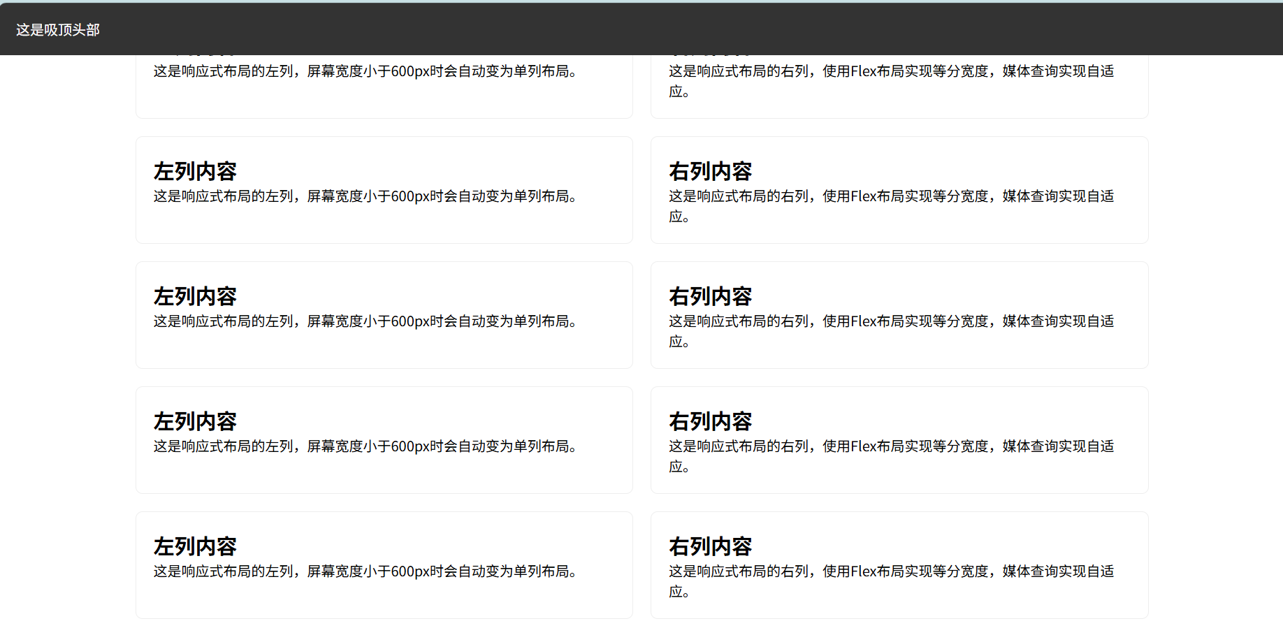
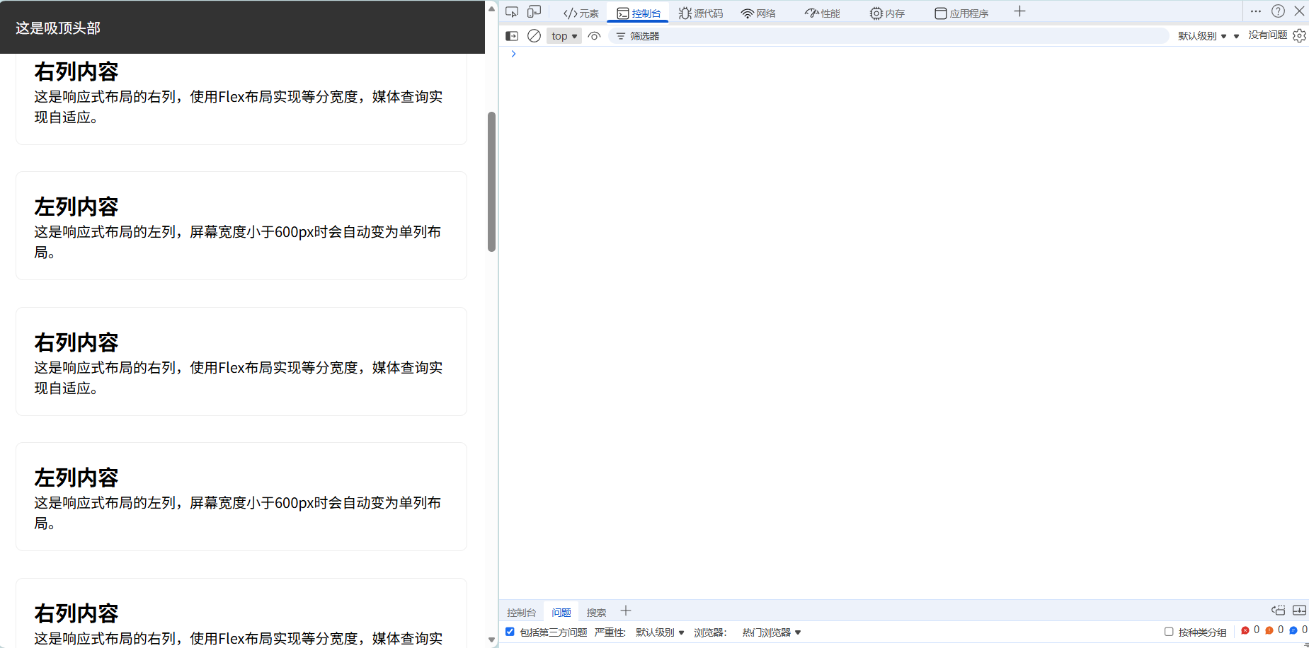
课后练习实战:完整响应式页面
要求:创建包含头部、内容区、底部的网页
实现:头部吸顶(滚动时不消失),内容区两列布局,屏幕 < 600px 时,内容区改为单列
1
2
3
4
5
6
7
8
9
10
11
12
13
14
15
16
17
18
19
20
21
22
23
24
25
26
27
28
29
30
31
32
33
34
35
36
37
38
39
40
41
42
43
44
45
46
47
48
49
50
51
52
53
54
55
56
57
58
59
60
61
62
63
64
65
66
67
68
69
70
71
72
73
74
75
76
77
78
79
80
81
82
83
84
85
86
87
88
89
90
91
92
93
94
95
96
97
98
99
100
101
102
103
104
105
106
107
108
109
110
111
112
113
114
115
116
117
118
119
120
121
122
123
124
125
126
127
128
129
130
131
132
133
134
135
136
137
138
139
140
141
142
143
144
145
146
147
148
149
150
151
152
153
154
155
156
157
158
159
160
161
162
163
164
165
166
167
168
169
| <!DOCTYPE html>
<html>
<head>
<style>
* {
margin: 0;
padding: 0;
box-sizing: border-box;
font-family: "PingFang SC", sans-serif;
}
header {
position: sticky;
top: 0;
background-color: #333;
color: white;
padding: 20px;
height: 60px;
line-height: 20px;
z-index: 999;
}
.content {
display: flex;
width: 100%;
max-width: 1200px;
margin: 20px auto;
gap: 20px;
padding: 0 20px;
}
.left-column, .right-column {
flex: 1;
padding: 20px;
border: 1px solid #eee;
border-radius: 8px;
}
footer {
background-color: #f8f9fa;
text-align: center;
padding: 20px;
margin-top: 30px;
color: #666;
}
@media (max-width: 600px) {
.content {
flex-direction: column;
}
.left-column, .right-column {
margin-bottom: 10px;
}
}
</style>
</head>
<body>
<header>这是吸顶头部</header>
<div class="content">
<div class="left-column">
<h2>左列内容</h2>
<p>这是响应式布局的左列,屏幕宽度小于600px时会自动变为单列布局。</p>
</div>
<div class="right-column">
<h2>右列内容</h2>
<p>这是响应式布局的右列,使用Flex布局实现等分宽度,媒体查询实现自适应。</p>
</div>
</div>
<div class="content">
<div class="left-column">
<h2>左列内容</h2>
<p>这是响应式布局的左列,屏幕宽度小于600px时会自动变为单列布局。</p>
</div>
<div class="right-column">
<h2>右列内容</h2>
<p>这是响应式布局的右列,使用Flex布局实现等分宽度,媒体查询实现自适应。</p>
</div>
</div>
<div class="content">
<div class="left-column">
<h2>左列内容</h2>
<p>这是响应式布局的左列,屏幕宽度小于600px时会自动变为单列布局。</p>
</div>
<div class="right-column">
<h2>右列内容</h2>
<p>这是响应式布局的右列,使用Flex布局实现等分宽度,媒体查询实现自适应。</p>
</div>
</div>
<div class="content">
<div class="left-column">
<h2>左列内容</h2>
<p>这是响应式布局的左列,屏幕宽度小于600px时会自动变为单列布局。</p>
</div>
<div class="right-column">
<h2>右列内容</h2>
<p>这是响应式布局的右列,使用Flex布局实现等分宽度,媒体查询实现自适应。</p>
</div>
</div>
<div class="content">
<div class="left-column">
<h2>左列内容</h2>
<p>这是响应式布局的左列,屏幕宽度小于600px时会自动变为单列布局。</p>
</div>
<div class="right-column">
<h2>右列内容</h2>
<p>这是响应式布局的右列,使用Flex布局实现等分宽度,媒体查询实现自适应。</p>
</div>
</div>
<div class="content">
<div class="left-column">
<h2>左列内容</h2>
<p>这是响应式布局的左列,屏幕宽度小于600px时会自动变为单列布局。</p>
</div>
<div class="right-column">
<h2>右列内容</h2>
<p>这是响应式布局的右列,使用Flex布局实现等分宽度,媒体查询实现自适应。</p>
</div>
</div>
<div class="content">
<div class="left-column">
<h2>左列内容</h2>
<p>这是响应式布局的左列,屏幕宽度小于600px时会自动变为单列布局。</p>
</div>
<div class="right-column">
<h2>右列内容</h2>
<p>这是响应式布局的右列,使用Flex布局实现等分宽度,媒体查询实现自适应。</p>
</div>
</div>
<div class="content">
<div class="left-column">
<h2>左列内容</h2>
<p>这是响应式布局的左列,屏幕宽度小于600px时会自动变为单列布局。</p>
</div>
<div class="right-column">
<h2>右列内容</h2>
<p>这是响应式布局的右列,使用Flex布局实现等分宽度,媒体查询实现自适应。</p>
</div>
</div>
<div class="content">
<div class="left-column">
<h2>左列内容</h2>
<p>这是响应式布局的左列,屏幕宽度小于600px时会自动变为单列布局。</p>
</div>
<div class="right-column">
<h2>右列内容</h2>
<p>这是响应式布局的右列,使用Flex布局实现等分宽度,媒体查询实现自适应。</p>
</div>
</div>
<div class="content">
<div class="left-column">
<h2>左列内容</h2>
<p>这是响应式布局的左列,屏幕宽度小于600px时会自动变为单列布局。</p>
</div>
<div class="right-column">
<h2>右列内容</h2>
<p>这是响应式布局的右列,使用Flex布局实现等分宽度,媒体查询实现自适应。</p>
</div>
</div>
<footer>© 2024 CSS学习笔记 - 响应式页面实战</footer>
</body>
</html>
|
总结
CSS 的核心在于选择器精准选取元素、属性控制样式细节、布局实现页面结构。本文从语法到实战,覆盖了 CSS 的核心知识点,包括:
五大类选择器及优先级规则,三种 CSS 使用方式及常见属性(颜色、边框、边距、文本、字体等),布局核心(display、position、float、Flex、响应式)。
掌握这些知识点后,可灵活实现各类网页样式与布局。实践是学习 CSS 的关键,建议多尝试修改示例代码,观察样式变化,加深对层叠规则和布局逻辑的理解。如果遇到样式冲突或布局问题,可利用浏览器开发者工具(F12)调试,查看样式优先级和元素盒模型信息。